

2025 Restaurant Furniture Color Trends Singapore Guide
Colour trends in Singapore’s F&B scene continue to evolve as customer expectations shift, new dining concepts emerge, and interior branding becomes more essential to business success. In 2025, restaurant furniture colours play a bigger role than ever—shaping ambience, reinforcing brand identity, and influencing customer behaviour. For business owners working with a restaurant furniture supplier Singapore, staying ahead of colour trends can help you remain competitive while creating a visually impactful dining experience.
This guide explores the biggest furniture colour trends of 2025, how they fit different restaurant themes, and how brands like Rasa Bloom support custom colour solutions for Singapore restaurants seeking standout interior design.
Why Colour Matters in Restaurant Furniture
Colour psychology plays a strong influence on customer mood, time spent dining, and perceived brand value. Many F&B brands use colour intentionally to achieve:
Improved ambience
Stronger brand recognition
Better photography aesthetic for social media
Consistent thematic design
Perceived comfort and sophistication
When working with custom restaurant furniture Singapore businesses, restaurant owners are increasingly seeking bespoke colours to differentiate themselves in the competitive F&B landscape.
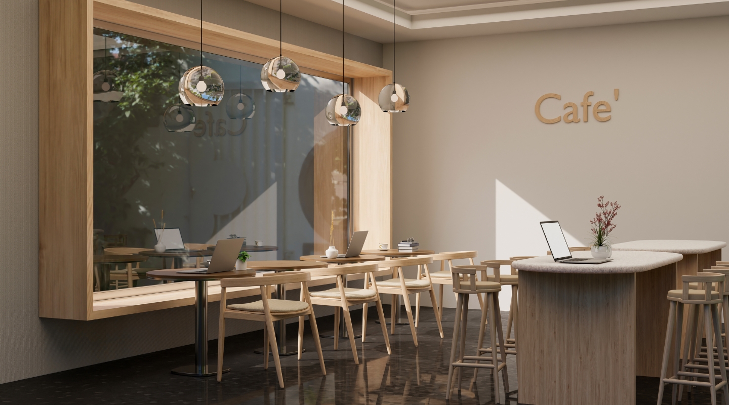
Trend 1: Earthy Neutrals for Cosy, Minimalist Dining
In 2025, earthy neutral palettes dominate casual cafés, lifestyle eateries, and modern fusion restaurants. These tones create a warm, organic feel suitable for diners who value comfort and calmness.
Common neutral furniture colours include:
Sand beige
Light walnut
Warm taupe
Soft olive
Stone grey
These colour palettes pair beautifully with Scandinavian, minimalist, and Japanese concepts. Neutrals also help highlight natural materials such as wood, rattan, and leather—common features in furniture from a restaurant furniture supplier Singapore like Rasa Bloom.

Trend 2: Coastal Blues for Waterfront and Wellness Dining Concepts
Post-pandemic consumer behaviour shows an increased appreciation for relaxation and calmness. This has led to a rising demand for coastal-inspired blues in furniture design.
Trending blue tones include:
Marine blue
Dusty aqua
Misty teal
Ocean grey-blue
Coastal blues are popular among East Coast cafés, seafood restaurants, beachside dining venues, and wellness-oriented concepts. They pair well with both light wood bases and minimalist metal frames.
Restaurants also choose blue tones for their calming psychological effect, making guests stay longer and order more—beneficial for revenue.
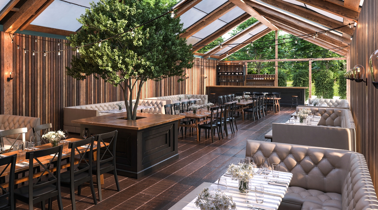
Trend 3: Tropical Greens Inspired by Biophilic Aesthetic
Singapore’s love for greenery strongly influences furniture trends. Tropical greens continue to be one of the most requested colour families for F&B furniture in 2025.
Trending tones include:
Forest green
Moss green
Sage
Emerald
Green is ideal for nature-themed dining, plant cafés, alfresco concepts, and restaurants within malls that wish to incorporate biophilic design elements. When paired with wood or rattan finishes, green becomes a timeless palette.
Rasa Bloom’s customisation service allows these tones to be matched across chairs, tables, and booth upholstery for a unified aesthetic.
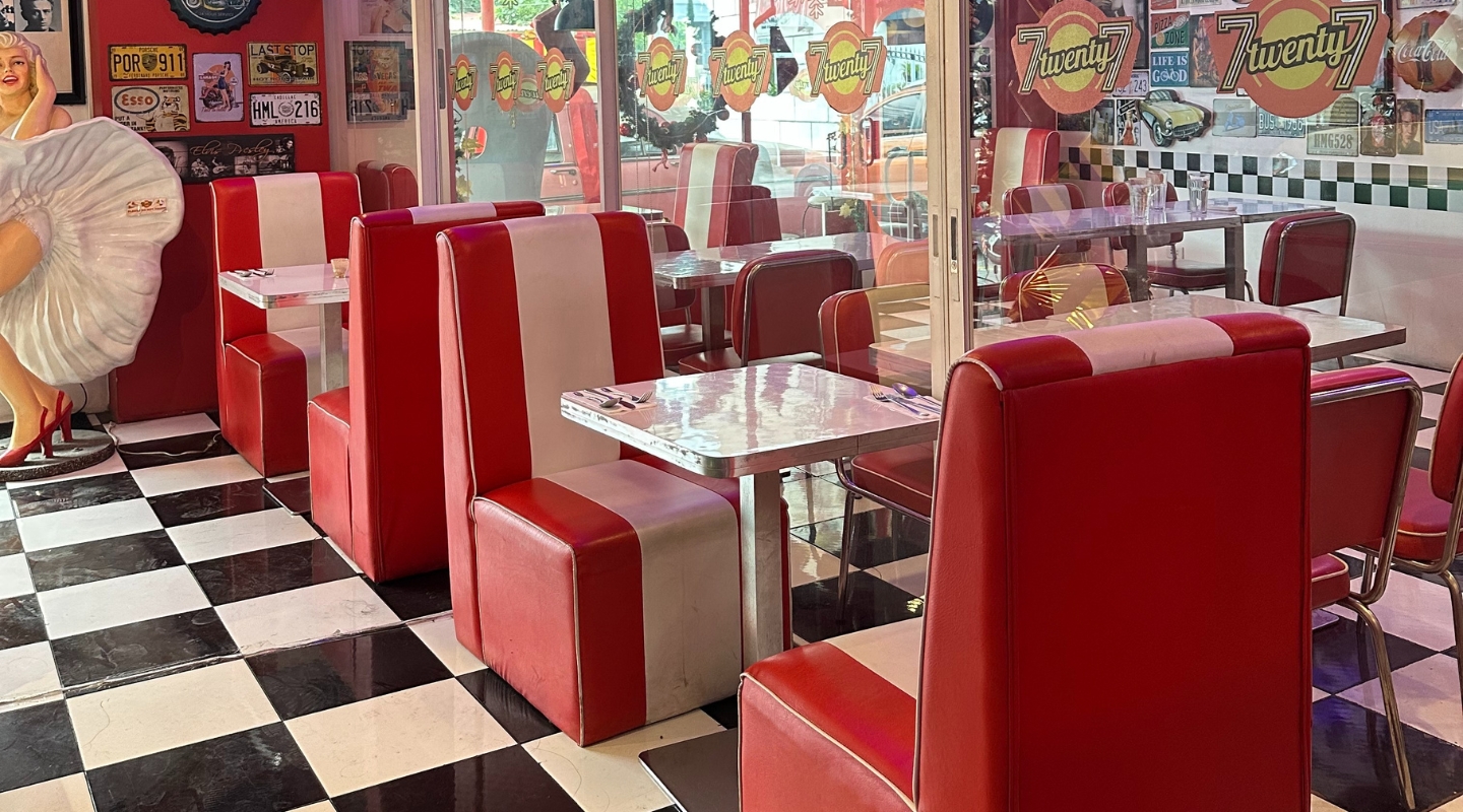
Trend 4: Deep Burgundy and Wine Tones for Upscale Dining
Premium restaurants and wine bars increasingly lean toward deep and luxurious colours such as:
Burgundy
Merlot red
Deep plum
Oxblood
These rich tones convey sophistication and pair well with velvet upholstery, dark wood table bases, and brushed metal accents.
This colour family is especially suitable for:
Steakhouses
Italian fine-dining
Fusion wine bars
Modern grill restaurants
Furniture suppliers offering custom restaurant furniture solutions often produce these colours in leatherette banquettes, high-back dining chairs, and upholstered lounges.
Trend 5: Matte Black and Charcoal for Industrial Interiors
Industrial dining remains popular across Singapore’s urban café and bar scene. Matte black, charcoal grey, and concrete tones dominate these settings, delivering a bold, modern aesthetic.
Common applications include:
Metal bar stools
Powder-coated table bases
Minimalist dining chairs
Concrete-effect table tops
These colours offer durability while staying timeless. Matte finishes are especially requested in 2025 due to their anti-fingerprint and scratch-resistant properties.
Restaurants opting for this palette typically partner with a restaurant furniture supplier that can deliver custom powder-coating or laminate solutions in industrial colour schemes.
Trend 6: Terracotta and Burnt Orange for Warm Mediterranean Concepts
Terracotta tones are rising in popularity with the growing trend of Mediterranean, Middle Eastern, and artisanal bakeries.
Popular shades include:
Burnt sienna
Clay orange
Toasted terracotta
Rustic cinnamon
These warm hues pair beautifully with natural textures—rope chairs, rattan seatings, and raw wood. The colour family enhances visual warmth and creates a handcrafted aesthetic appealing to customers seeking authentic culinary experiences.
Trend 7: Dual-Tone Furniture for Modern Dining Concepts
Dual-tone furniture is gaining popularity, particularly for restaurants wanting a contemporary, custom look without fully redesigning their interiors.
Examples include:
Black frame with walnut seat
White base with pastel upholstery
Metal legs paired with wood finish
Neutral seat colours matched with bold backs
Dual-tone pieces allow flexibility and create eye-catching visual contrast. Rasa Bloom offers a large range of mix-and-match options that help restaurants customise furniture across multiple colour combinations.
How to Choose the Right Furniture Colour for Your F&B Concept
Selecting the right colour involves more than following trends. Restaurant owners should evaluate several practical considerations:
1. Understand Your Brand Identity
Your furniture colour should reflect your restaurant personality—playful, premium, calm, vibrant, or traditional.
2. Match Colours to Concept Type
For example:
Fine dining → deep hues and dark woods
Casual cafés → neutrals and pastel colours
Coastal restaurants → blues and natural tones
Industrial spaces → charcoal and black
3. Consider Lighting Conditions
Warm vs cool lights affect furniture colour perception. Colours may appear different in alfresco vs indoor environments.
4. Prioritise Durability
Darker colours hide stains; lighter colours require easy-clean surfaces or stain-resistant materials.
5. Plan Consistency Across Furniture Types
Ensure uniformity across:
Chairs
Booth seating
Tables
Bar stools
Outdoor sets
This avoids mismatched aesthetics that confuse customers.
6. Work with a Reliable Supplier
A supplier like Rasa Bloom ensures colour matching accuracy across custom pieces and offers durable finishes suitable for commercial environments.
Why Work with Rasa Bloom for Custom Restaurant Furniture Colours
Rasa Bloom has earned a strong reputation as a trusted restaurant furniture supplier Singapore because of its ability to deliver colours that align with the latest trends and brand requirements. The company provides:
Custom powder-coated metal finishes
Wide colour ranges for upholstery and leatherettes
Mix-and-match table top and base combinations
Durable stains and laminates for countertops
Colour-coordinated banquette seating
Whether your concept is industrial, minimalist, coastal, or heritage-inspired, Rasa Bloom helps achieve a consistent, professional interior look that supports long-term branding goals.
Frequently Asked Questions
1. What is the most popular restaurant furniture colour in Singapore for 2025?
Neutral tones and sage green are leading trends, followed by matte black for modern industrial venues.
2. Are custom colours more expensive?
Customisation may cost slightly more, but most restaurants find the branding benefits worth the investment.
3. How can I ensure the colour stays consistent across all my furniture pieces?
Work with a supplier capable of professional colour matching—Rasa Bloom provides reliable solutions across materials and finishes.
4. Do certain colours require more maintenance?
Light pastel tones may require more frequent cleaning, while darker colours are more forgiving with stains and daily wear.